


A birthday, a president, and some book cover designs
Choosing a book cover. What works? What doesn't?

A preface: My heart is breaking for everyone in Los Angeles. I lived there for 13 years and know those fire areas well. Anyone who’s visited Los Angeles has likely enjoyed the beautiful drive down Sunset Blvd., through the Palisades, down to Will Rogers State Beach and Highway 1, or the Pacific Coast Highway (PCH). I enjoyed Thanksgiving dinners at a home overlooking that beach, and that home is now gone. SO much now gone. It brings flashbacks to my own mother’s home burning down in the Oakland Hills fire of 1991. I mention in this post that today has been set as a national day of mourning. We now have added reasons for that. 🙏
January 9 is my mother, Lillian McCloy’s birthday. She’d be 99 this year. (She passed away just after her 97th birthday.) Today also happens to be a national day of mourning for President Jimmy Carter. Flags are at half-staff. Government offices are closed. And his official state funeral will be taking place in Washington, D.C..
Jimmy Carter went into hospice a few weeks after my mother did in 2023. I joked that if they passed away on the same day, he’d steal my mother’s thunder. We called her Thor (the God of Thunder) because it’s an abbreviation of her Icelandic middle name “Thorbjorg,” and a most apropos title for her. You didn’t mess with Thor.
My mother passed away several weeks after she went into hospice care. Carter lived for two more years in this earthly realm. May he now rest in peace (as he did in life).
My mother’s birthday gives cause to celebrate her memoir, Six Car Lengths Behind an Elephant. For this post, I thought I’d write about the initial book cover ideas. I’ll also share my sister Kristin’s experience with book covers of her novel, Velocity.
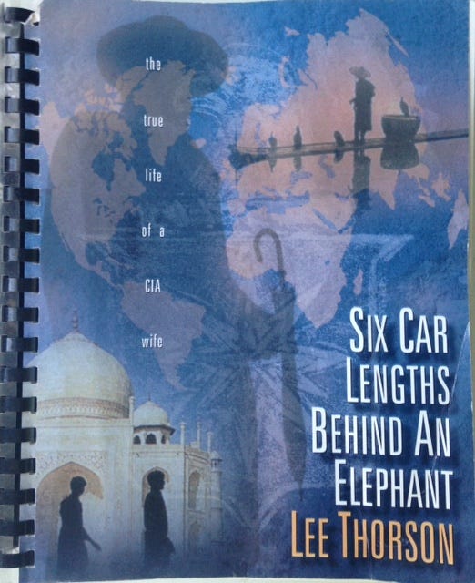
My mother typed her manuscript in 1993, tap-tap-tap-tapping away, on her Selectric typewriter every morning. When she finished, she asked my brother John if he would design an 8x11 cover image for her manuscript, which she sent to a few initial readers. John is a graphic designer. He has designed movie posters, DVD covers, and ad campaigns for several films from Universal Studios, among other things.
Here’s the cover that John created for her original manuscript. You’ll see that my mother used a pen name at the time, Lee Thorson.
As some In This Life subscribers know, I dusted off the original manuscript and edited it in 2016. I’m a freelance editor, so the book was my special gift for her 90th birthday. (Link to read that backstory.) I did a developmental edit and some copyedits. I then hired a final copyeditor and a book cover designer to help complete the project.
What would make a good cover for this book?
What would you picture as a good cover design for a memoir by an undercover CIA officer’s wife? For a memoir that takes place in the U.S., Spain, India, Japan, Venezuela, and Singapore? For a personal story that spans the Cold War years of 1962-1986? For a true, gripping, surprising, and often funny book about marriage, espionage, family, and the meaning of home?
Teddi Black is the cover designer I worked with, and after reviewing the book and the information I provided, she came up with three initial book cover ideas.
This was idea #1:
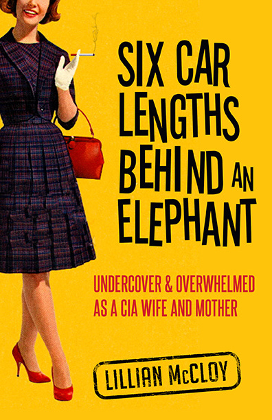
Was this the right cover for my mother’s book?
My mother had gone blind from macular degeneration, so I described each of the cover designs to get her feedback. She immediately said no to this one; she said it didn’t represent the seriousness of her book. I agreed. Though it’s a fun and vibrant cover that represents a certain era and mood, it does not adequately represent the overall tone of her story.
This was idea #2:
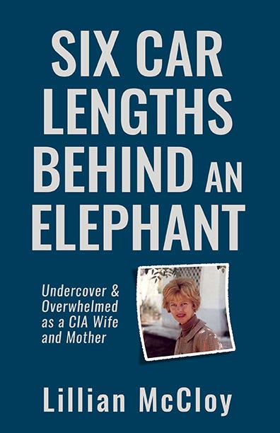
The title text is clearly the main focus here, but this one seemed too flat and didn’t reflect the tone of her book either. It needed some life. It needed more.
And then, there was idea #3:
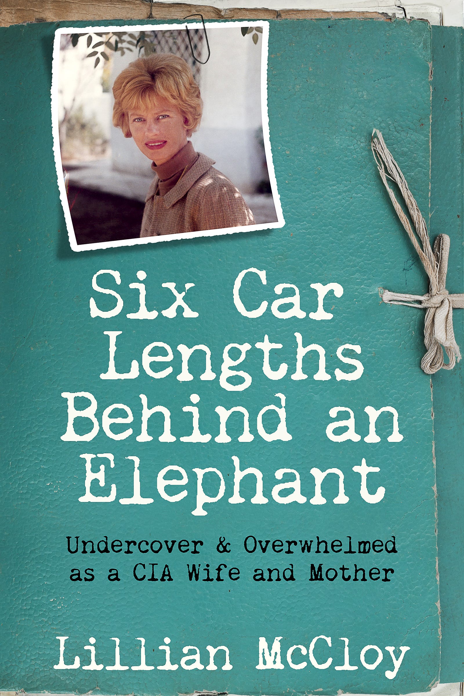
I described this one to my mother, and she agreed this was our selection. What you see is the final cover after a few minor revisions (I think I thought of the typewriter font.) I love everything about it. I love the file folder idea (Teddi envisioned it as a top secret file on my mother); the paper clip over my mother’s 1968 photo; the typewriter font; and the taupe color. (Her photo was from a roll of film I had only recently found and developed, too. It was perfect.)
People most definitely judge a book by its cover, and I think Teddi did a beautiful job.
My sister’s book covers
My sister Kristin McCloy is an accomplished novelist. Her first book Velocity was quite the sensation when it was published by Random House in 1988. She didn’t have a say in the cover design, as is the case for most authors with big publishers, so when the book came out, the cover was a surprise to her.
What do you think?
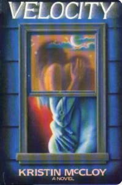
Kristin is a beautiful writer, and her book is erotic in places, but it’s also a story of grief, loss, and much more. She hated the hardcover design. It was cheesy and looked like one of those cheap romance novels you might buy at a drugstore, instead of the ravely-reviewed book she’d written. She claims, “the original book cover killed the book.”
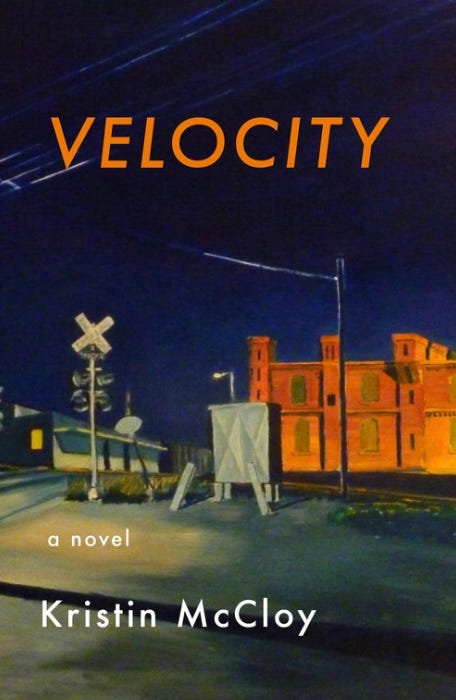
The ebook came out many years later, and that cover Kristin likes. It’s actually an image of her friend Jeff Bennett’s painting of a location in Durham, North Carolina. Velocity is also set in a small town in N.C..
Foreign book covers
Velocity was translated into many different languages. Every foreign publisher created their own cover design, so Kristin accrued an entire bookshelf of different covers from translated books. It was fun to see what each publisher came up with. (I don’t have those books, or I’d share sample images.)
Author Anne Patchett wrote a great essay (“Cover Stories”) about her own experiences with her book covers. You’ll find that essay in her book, “These Precious Days.” (Interestingly, as it turns out, that particular book’s cover is also an image of a painting by the author’s good friend. This one is a painting of Patchett’s dog, Sparky.)
Share your thoughts:
If you’ve read Six Car Lengths Behind and Elephant or Velocity, what did you think about their book covers? Do you think they adequately reflect or help sell each book?
What do you think makes a good and alluring book cover? Do you have a favorite book cover design? Or a book cover-related experience you’d like to share?
Are you an author, cover designer, or publisher? What’s your experience been around book cover designs?
I quite love this particular piece of yours. As a graphic designer, I find book cover design a fascinating topic, but a daunting task attempting to visually interpret an author's book. Between choosing colors, typefaces and imagery, it's fun to think of design elements that would pull a reader in from the front cover to the pages.
I really do like the current design on your mother's memoir. It does look like you're going to open up a case file on mystery and intrigue, while the photo belies innocence. You wonder just what you're going to find!
For velocity, I like the tone of the painting and the contrast of the colors. With that perspective in the painting, it pulls you to the center inviting you to travel down that street. All the lines are soft and blurred giving it motion.
Having been in Durham, NC last night, I wonder where this exact location is? I want to take a side trip and visit. Maybe take my own photo.
I must say, buying digital books are great, but I do love the smell of paper and ink.
Love this book talk and really appreciate seeing the evolution of your mom and sisters books. I lucked out mostly in my own process for the cover for my first book, Technically Food. My publisher and I went through three rounds before we selected one. I don't think the final cover is 100% perfect but it was so much better then the previous iterations. My book has been translated into Chinese - the best cover to date; Simple Chinese - very basic; and Korean -- too fun there are donuts, but I like it. I had no involvement in the translations.